Your profile
Card style
Make your card see-through, blur what's behind it, change its size, add a tilt or a sweeping light, and pick or design a shadow.
The card is the panel that holds your profile. You change it under Look, in the Card box.
See-through, blur, size and spacing#
| Setting | Range | Default | What it does |
|---|---|---|---|
| Card colour | 0 to 100 % | 100 % | Lower it to let your background show through. Below 10 % the card’s border disappears too. |
| Background blur | 0 to 100 px | 0 px | Blurs whatever shows through the card. |
| Size | 75 to 175 % | 100 % | Makes the whole card bigger or smaller on computers. Phones always use 100 %. |
| Spacing | 25 to 200 % | 100 % | The gaps between everything on your card: avatar, name, bio, integrations, links and badges. |
| Padding | 0 to 200 % | 100 % | The space between the edge of your card and what’s inside it. |
All five are free. Spacing and padding can be different on phones.
Tilt on hover#
Turn on Tilt on hover and the card leans towards the mouse pointer. It only works with a mouse, so phones and tablets don’t tilt. Visitors who turned off animations don’t see it either. Free.
Add a sweep#
Turn on Sweep and a light travels along the border of your card. Free.
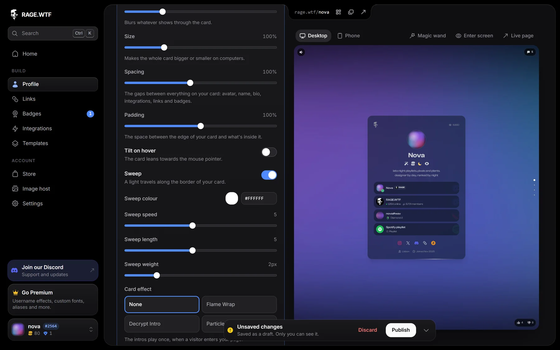
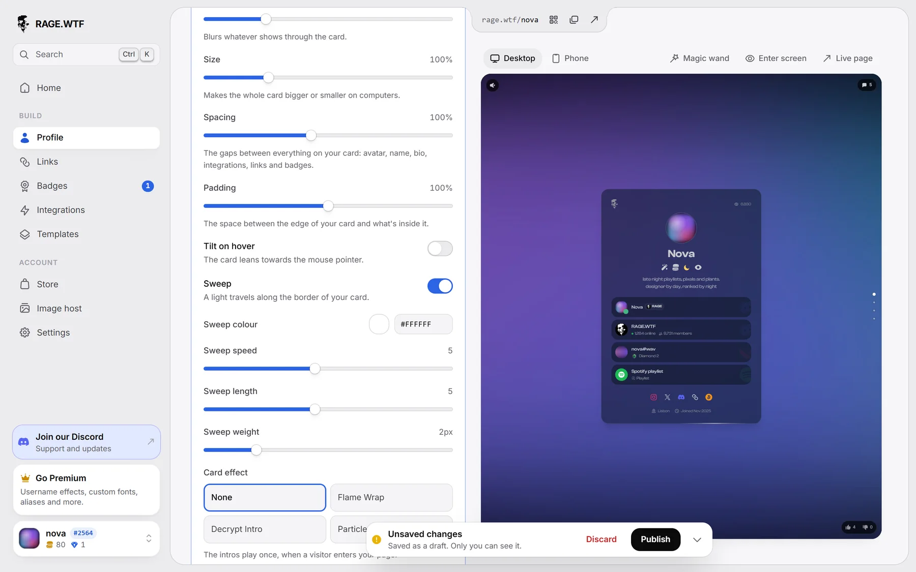
When it is on, you can change:
| Setting | Range | Default |
|---|---|---|
| Sweep colour | any colour | follows your text colour |
| Sweep speed | 1 (slowest) to 10 (fastest) | 5 |
| Sweep length | 1 (shortest) to 10 (longest) | 5 |
| Sweep weight | 1 to 6 px | 2 px |
For visitors who turned off animations, the light stays still.
Add a card effect#
Under Card effect, pick one. All are free.
| Effect | What it does |
|---|---|
| Flame Wrap | Flames rise from your card, whose top edge chars and burns away into them, with sparks and smoke. |
| Decrypt Intro | Everything on your card (text, avatar, links) starts as scrambling code, and each piece decodes into place on its own. |
| Particle Intro | Everything on your card starts as dust in its own colours, and each piece’s dust blows away to show it. |
The intros play once, when a visitor enters your page (after the enter screen if you have one). Flame Wrap and Decrypt Intro take an Effect colour. Visitors who turned off animations see the card straight away. Scenes can use your card’s effect or pick their own (see Scenes).
Pick a shadow#
Under Shadow, click a tile. Default is a soft drop shadow, None removes it. Click Show all 42 shadows for every preset.
The presets are Emboss, Bottom Line, Base, Inner Shadow, Neumorphic, Bottom Float, Standard, Aesthetic, Demure, Jubilation, Sprightly, Vigorous, Euphonious, Crescendo, Mondegreen, Nimble, Stepped Shadow, Blue Offset, Blue Bottom, Blue Stepped, Next.js, Champagne, Blush, Rainbow, Neon Glow, 3D Button, Layered Card, Realistic, Dual Tone, Neon Border, Floating Card, Inset Highlight, Soft Glow, Support, Cyberpunk, Spotlight, Retro Game, Gradient Glow, Sunset and Ocean Depths. All presets are free.
Design your own shadow#
- Pick the shadow you want to start from.
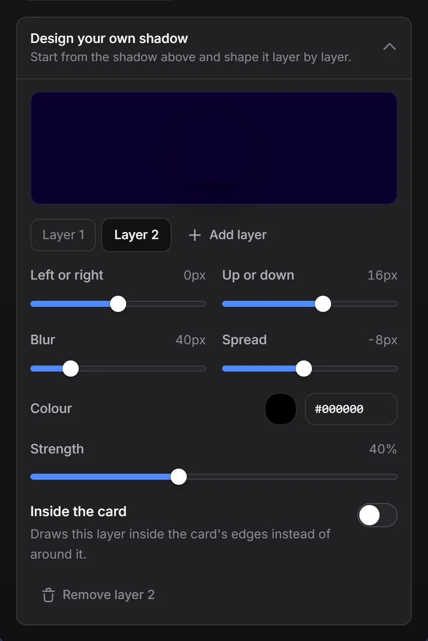
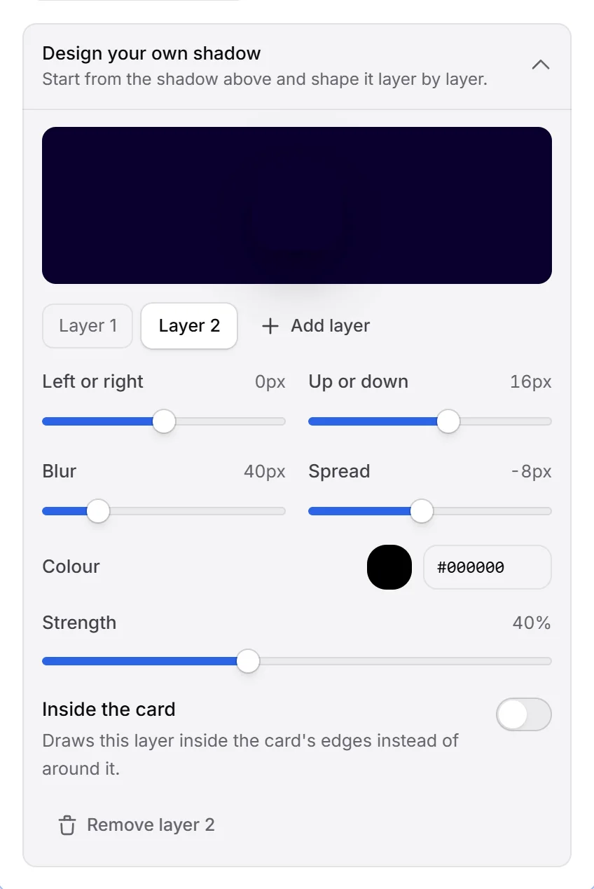
- Click Design your own shadow to open the designer.
- Pick a layer (Layer 1, Layer 2 and so on) and change it:
- Left or right and Up or down: -100 to 100 px
- Blur: 0 to 200 px
- Spread: -100 to 100 px
- Colour and Strength (0 to 100 %)
- Inside the card: draws the layer inside the card’s edges instead of around it
- Click Add layer to stack another one, up to 6 layers. Remove layer deletes the one you are editing.
- Press Publish.
Your design shows as a selected Yours tile in the shadow list.
Card style on phones#
Card colour, blur, sweep and shadow can be different on phones. Size and tilt don’t apply to phones. See desktop and phone.