Your profile
Different looks on computers and phones
Give phones their own colours, background, font or effects, and learn which settings are always the same on every device.
Your page can look different on phones than on computers. The Desktop and Phone switch in the editor decides which device you are styling.
Switch devices#
- On a computer, the switch sits above the preview.
- On a phone, it sits above the section list, and again inside the full-screen preview.
With Desktop selected, the preview shows a computer screen and your style changes apply to computers and phones. With Phone selected, the preview shows a phone and your changes apply to phones only.
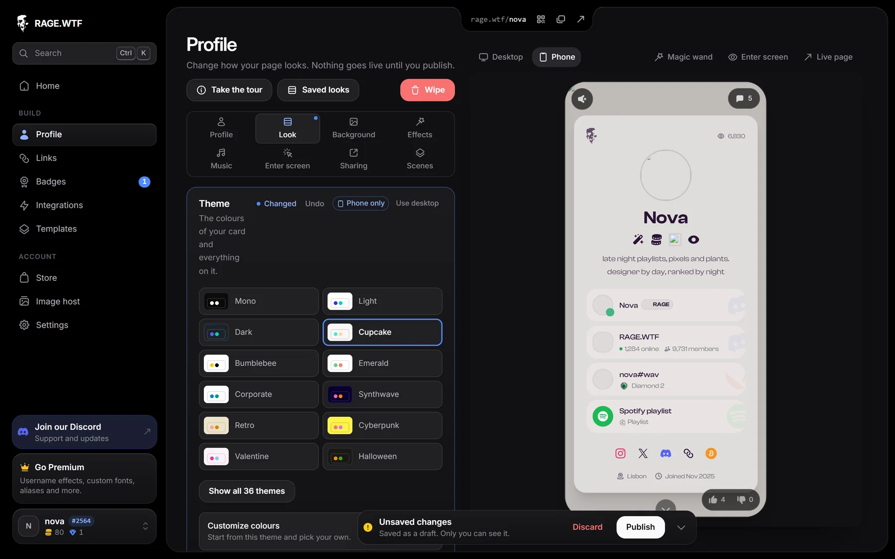
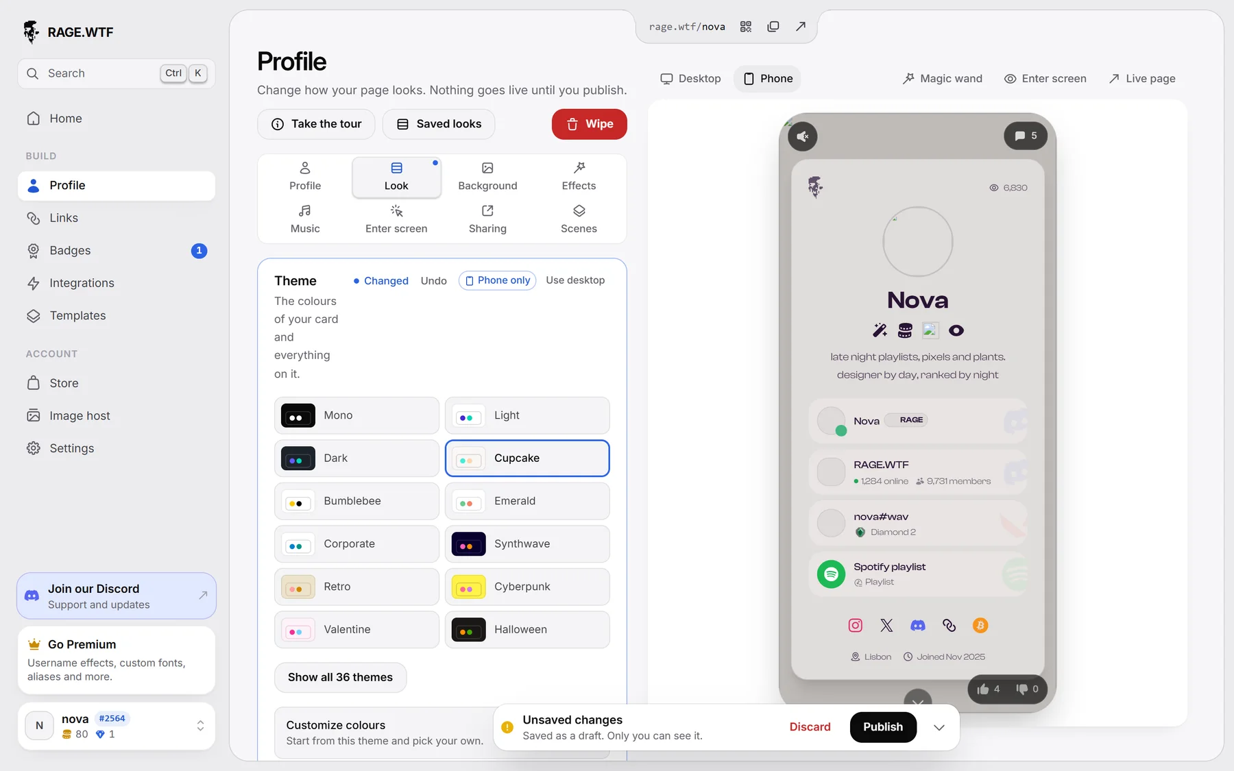
Give phones their own style#
- Style your page with Desktop selected first. Phones use these settings too.
- Switch to Phone.
- Change what should be different on phones, for example the theme or the background.
- Press Publish.
Every box of settings with phone-only values shows a Phone only tag. Click Use desktop next to it to make phones follow your computer settings again.
Phones are screens up to 767 pixels wide.
What can differ on phones#
- Theme and colours
- Font, including your own font
- Card: card colour, blur, sweep and shadow
- Background image or video, and background effect
- Name effect and colour tweaks, avatar shape
- Typewriter bio
- Badge and link style
- Cursor settings (only computers show them)
- Magic wand sizes and positions
What is always the same#
These settings are shared by every device. The Profile section says so while Phone is selected.
- Avatar, display name, bio text and location
- Card layout and the On your card switches
- Privacy settings
- Tab title animation
- Enter screen, music, sharing and scenes
Things phones don’t do#
- Card size: phones always show the card at its normal size, so the Size slider is greyed out on Phone.
- Tilt on hover: phones have no hover, so the card stays still.
- Cursors and trails: phones have no mouse pointer, so they never show.
- Audio visualizer: not shown on phones.
- Modern layout: the card stacks on phones. Magic wand moves you made on Desktop don’t apply to the stacked card unless you move items on Phone too. Sizes still carry over.