Your profile
Themes and colours
Pick one of 36 built-in themes or make your own colours, corners and browser controls for your page.
A theme sets the colours of your page, your card and everything on it. All themes and custom colours are free.
Pick a theme#
- In the dashboard, open Profile, then Look.
- Under Theme, click a theme. The preview changes right away.
- Click Show all 36 themes to see every theme.
- Press Publish when you are happy.
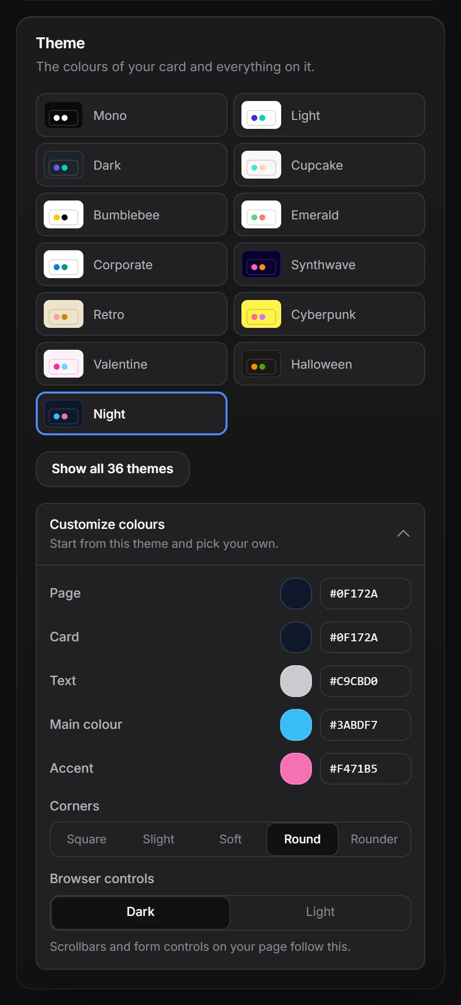
Each tile shows a small sample of the page, card, main colour and accent colour.
The built-in themes are Mono (the default for new pages, pure black and white), Light, Dark, Cupcake, Bumblebee, Emerald, Corporate, Synthwave, Retro, Cyberpunk, Valentine, Halloween, Garden, Forest, Aqua, Lo-Fi, Pastel, Fantasy, Wireframe, Black, Luxury, Dracula, CMYK, Autumn, Business, Acid, Lemonade, Night, Coffee, Winter, Dim, Nord, Sunset, Caramel Latte, Abyss and Silk.
Make your own colours#
- Pick the theme closest to what you want.
- Click Customize colours to open it.
- Change any of these:
- Page: the colour behind your card.
- Card: the card itself.
- Text: your text.
- Main colour: buttons and highlights.
- Accent: a second highlight colour.
- Under Corners, pick Square, Slight, Soft, Round or Rounder.
- Under Browser controls, pick Dark or Light. Scrollbars and form controls on your page follow this.
As soon as you change one of these, the theme list shows a selected Your colours tile. Other colours, like muted text, borders and text on buttons, are worked out for you so they stay readable.
Pick a colour#
Click a colour swatch to open the colour picker. You can drag in the colour area, use the hue slider, pick a colour from your screen with the eyedropper (in browsers that support it), or type a hex code like #ff0055 in the field next to the swatch.
Colours on phones#
Switch to Phone to give phones a different theme. See desktop and phone.
Keep a theme for later#
Save your colours together with the rest of your style as a saved look.